Emil Oscar Lanne
Emil Oscar Lanne
Case Study
client:
Huge Inc
Agency Rebrand
Scroll for more
Case Study
client:
Huge Inc
Agency Rebrand
Scroll for more
Case Study
client:
Huge Inc
Agency Rebrand
Scroll for more
Case Study
client:
Huge Inc
Agency Rebrand
Scroll for more
Description
My Role:
Creative Direction
Design
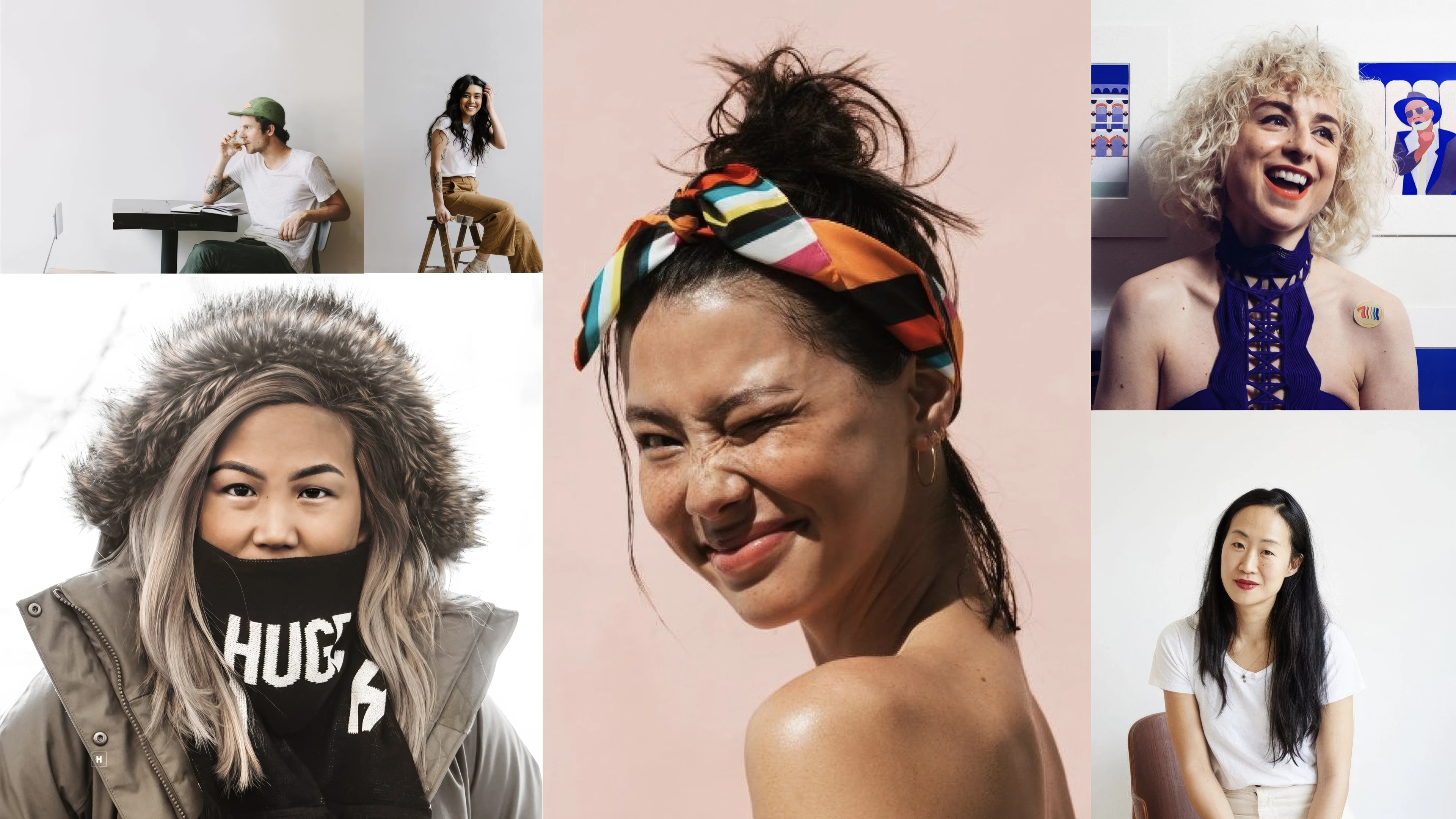
Collaborators:
Elliot Wright
In 2020, the decision was made to undertake a significant update for the Huge agency brand. For a design agency, this can be one of the hardest things to do! With a longstanding focus on their brand identity, Huge has consistently positioned it as a way to stand out and a source of internal pride. Having been part of the company for nearly eight years, I had a unique understanding of its roots and heritage, making me a central figure in considering how to subtly modernize certain elements that were beginning to show signs of aging.
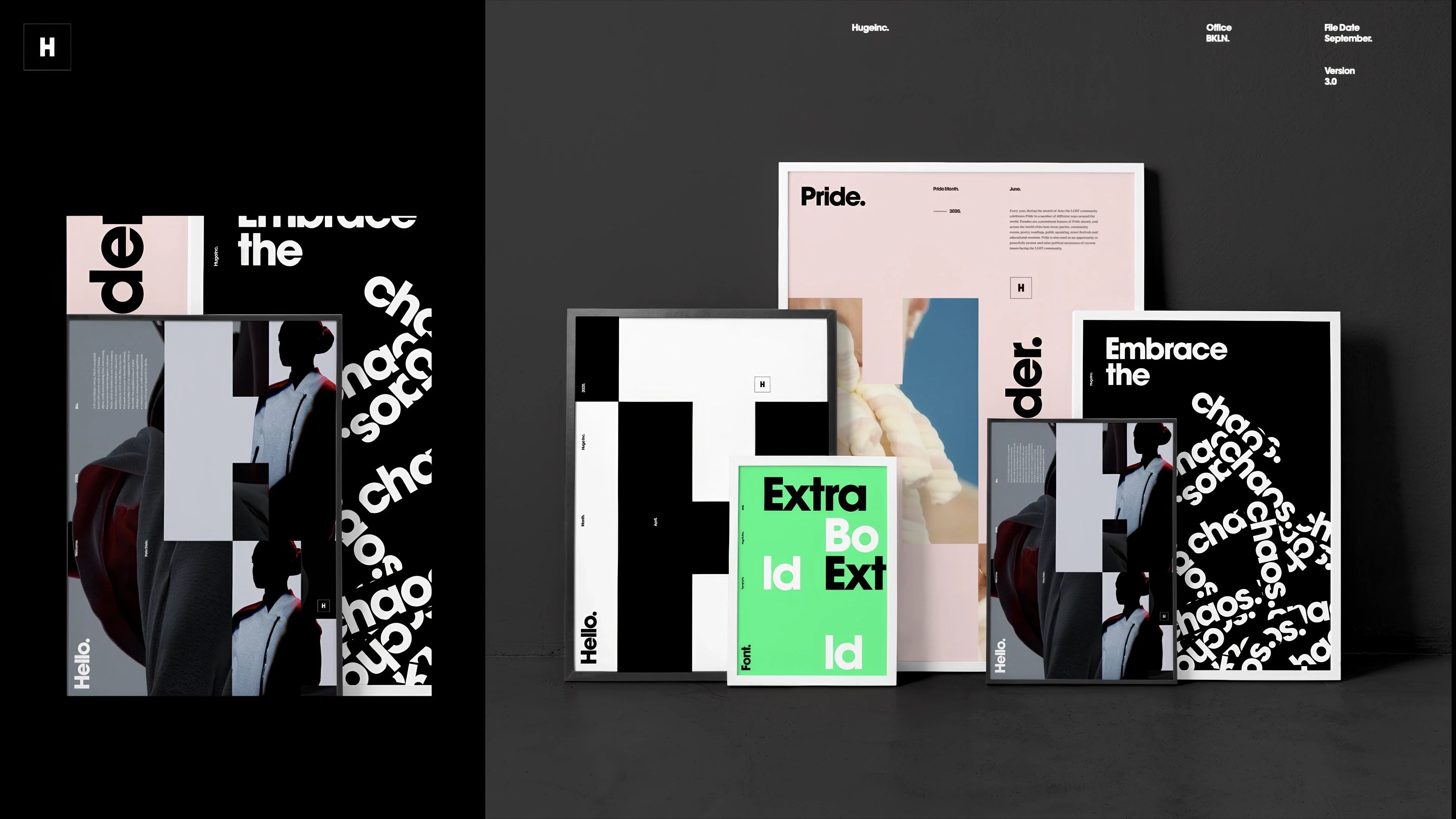
Collaborating closely with a small team, we embarked on shaping and refining the brand's evolution. Our objective was to build upon the foundation and rebellious appearance established by Huge in the past, preserving its iconic design and tonality while infusing it with a contemporary feel.
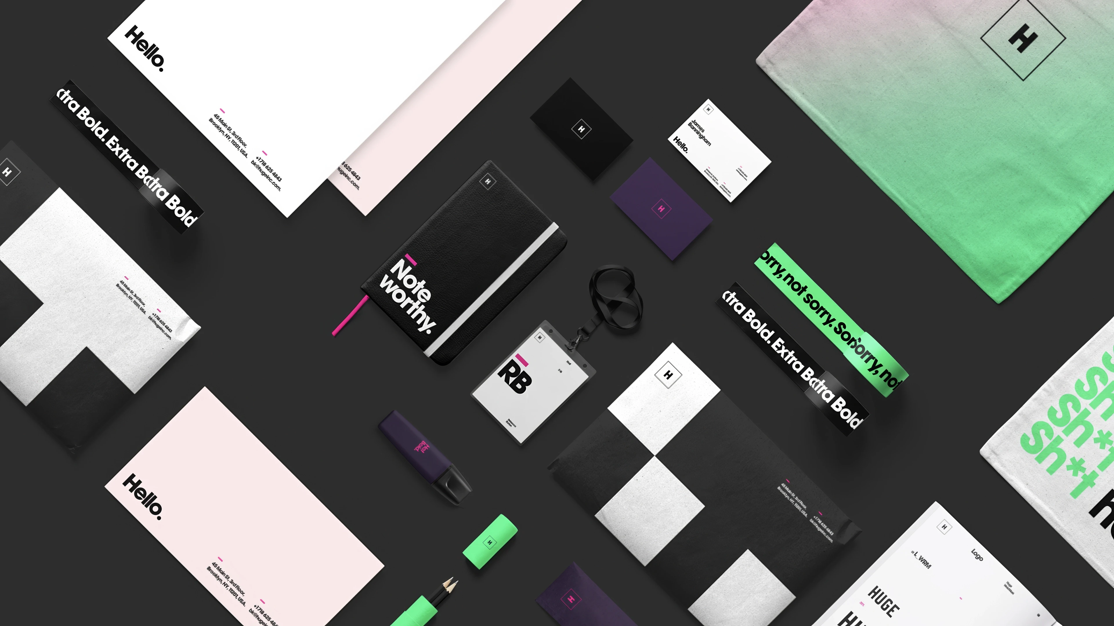
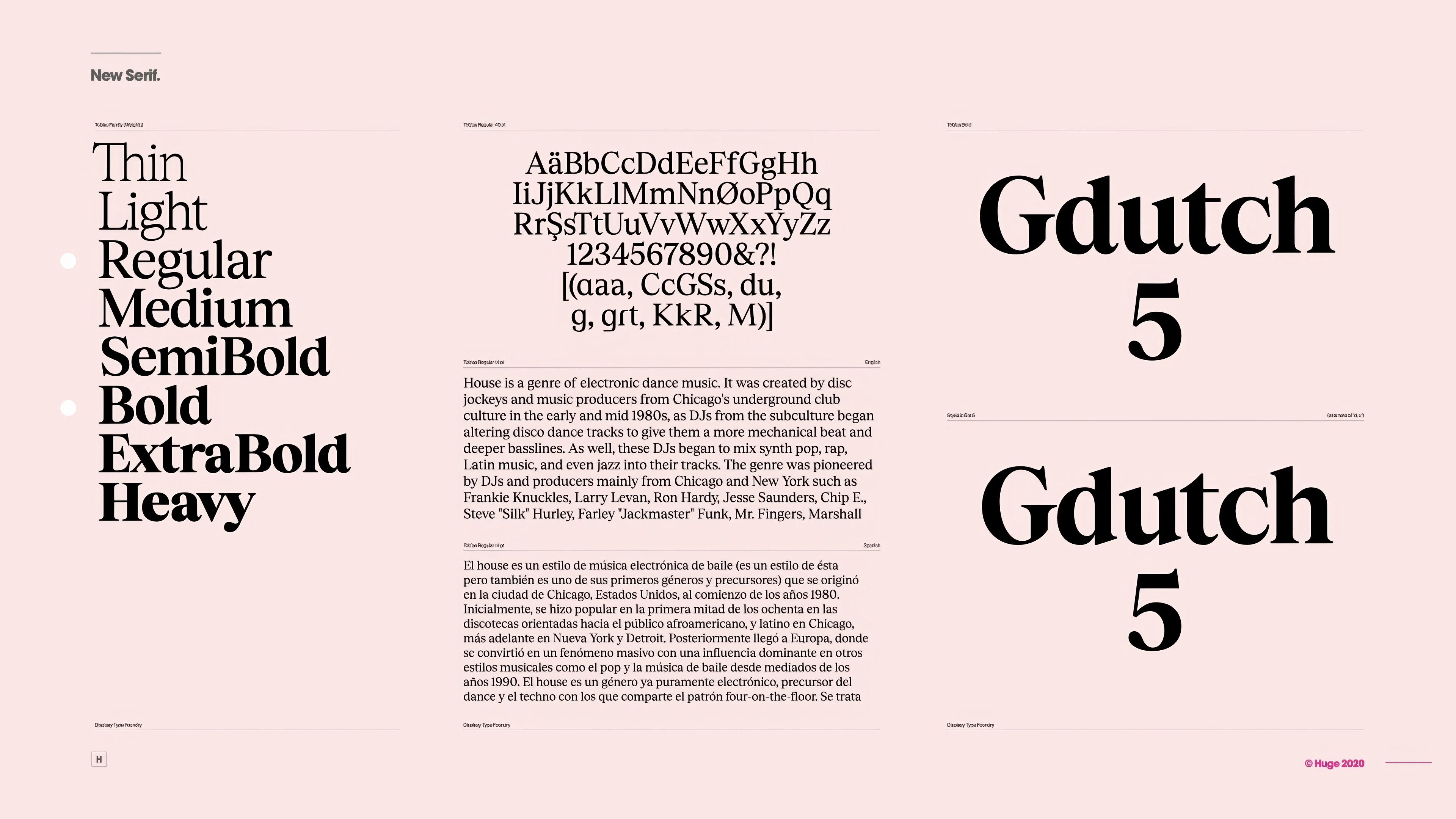
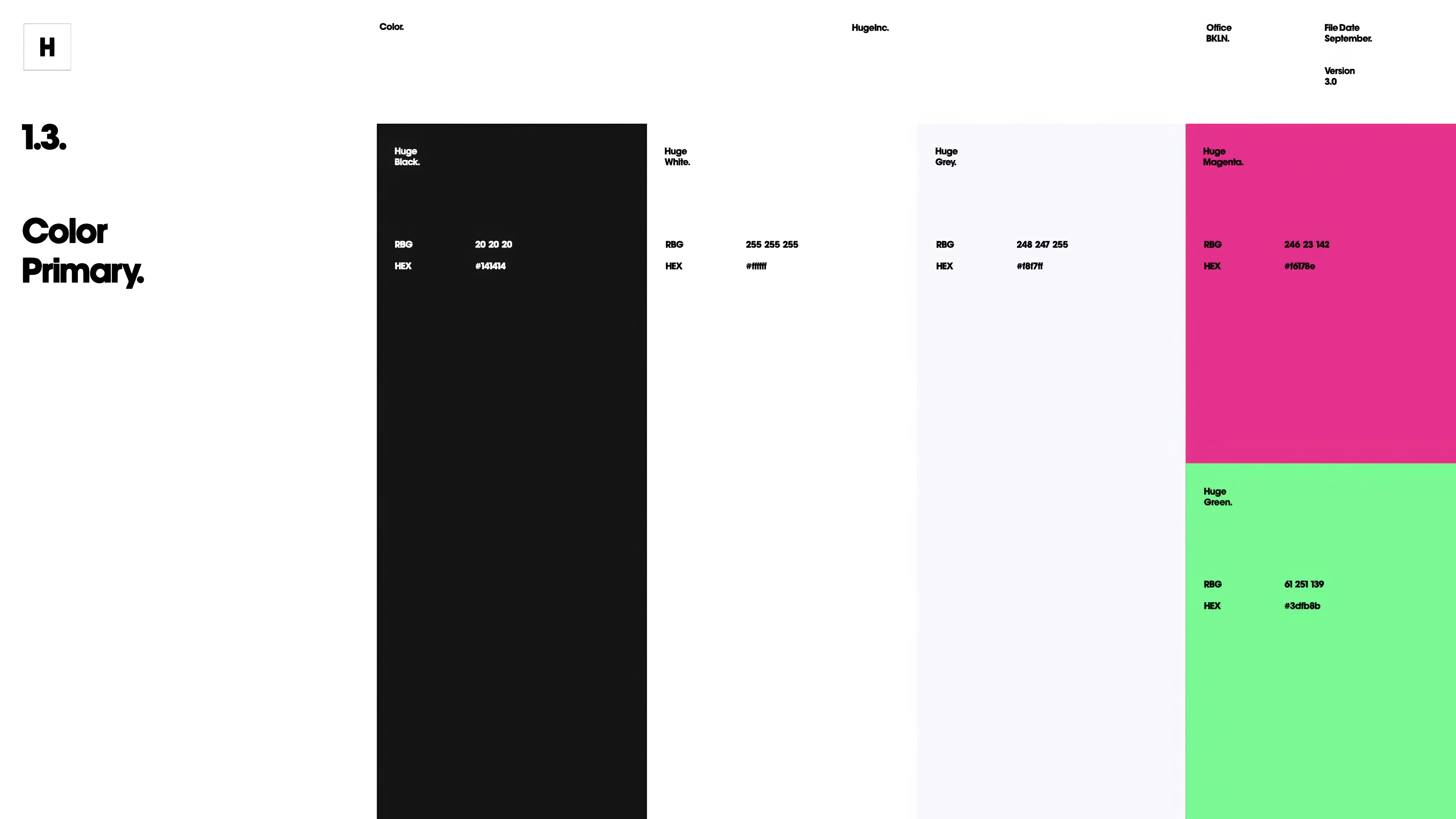
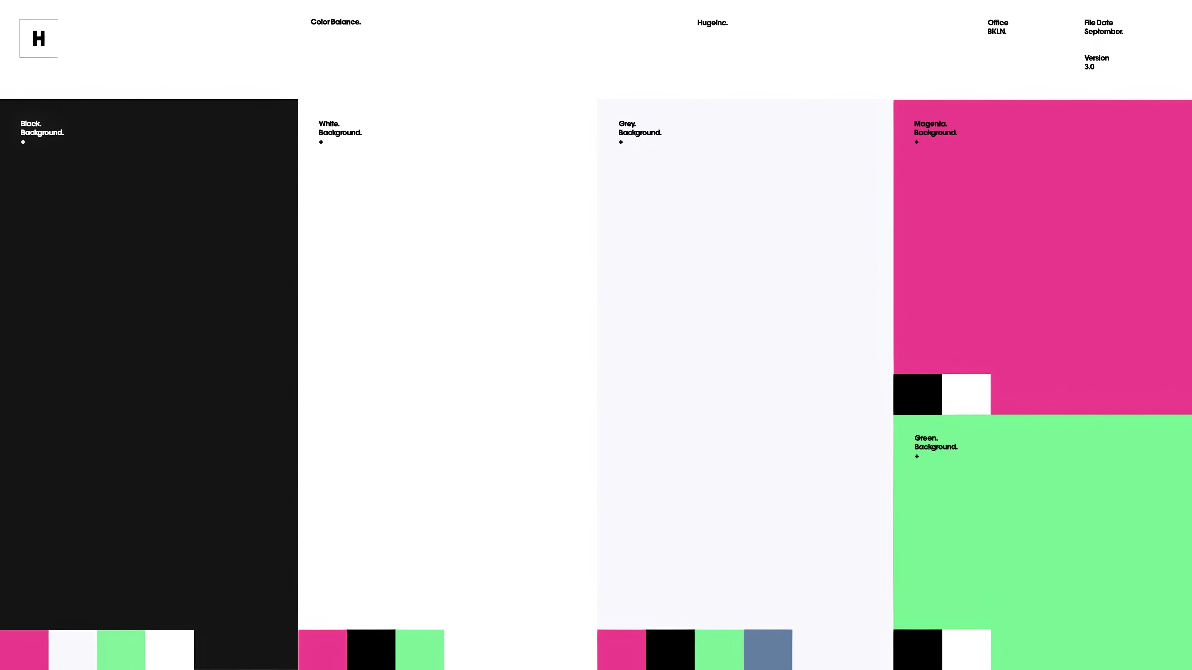
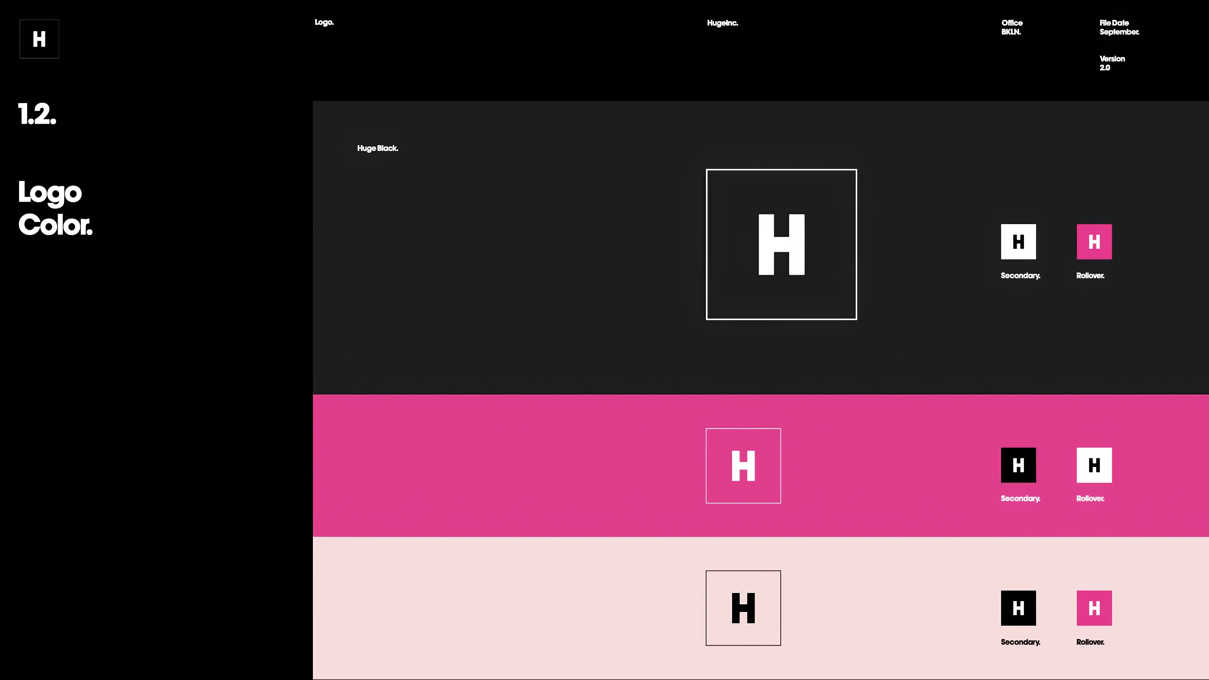
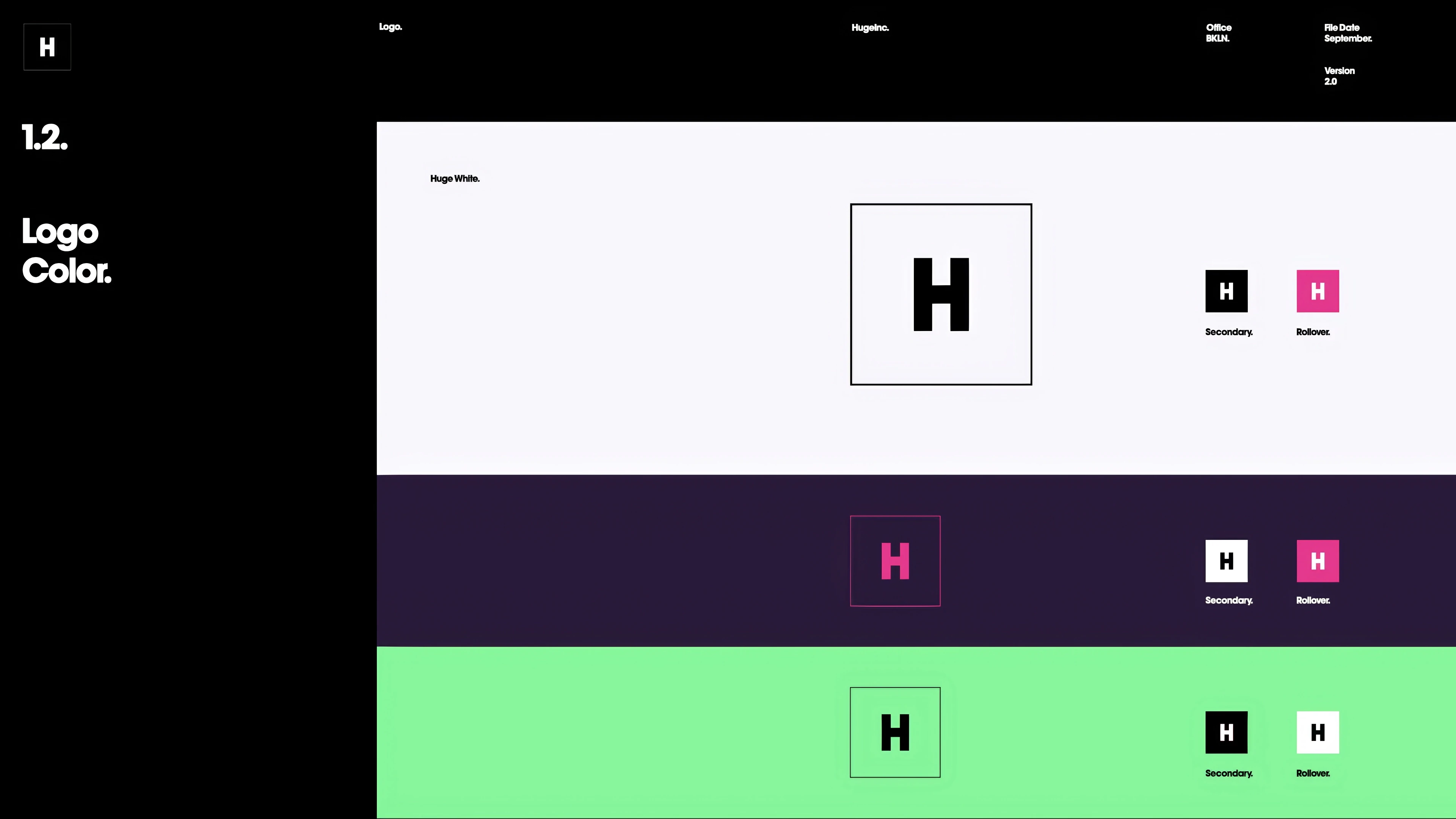
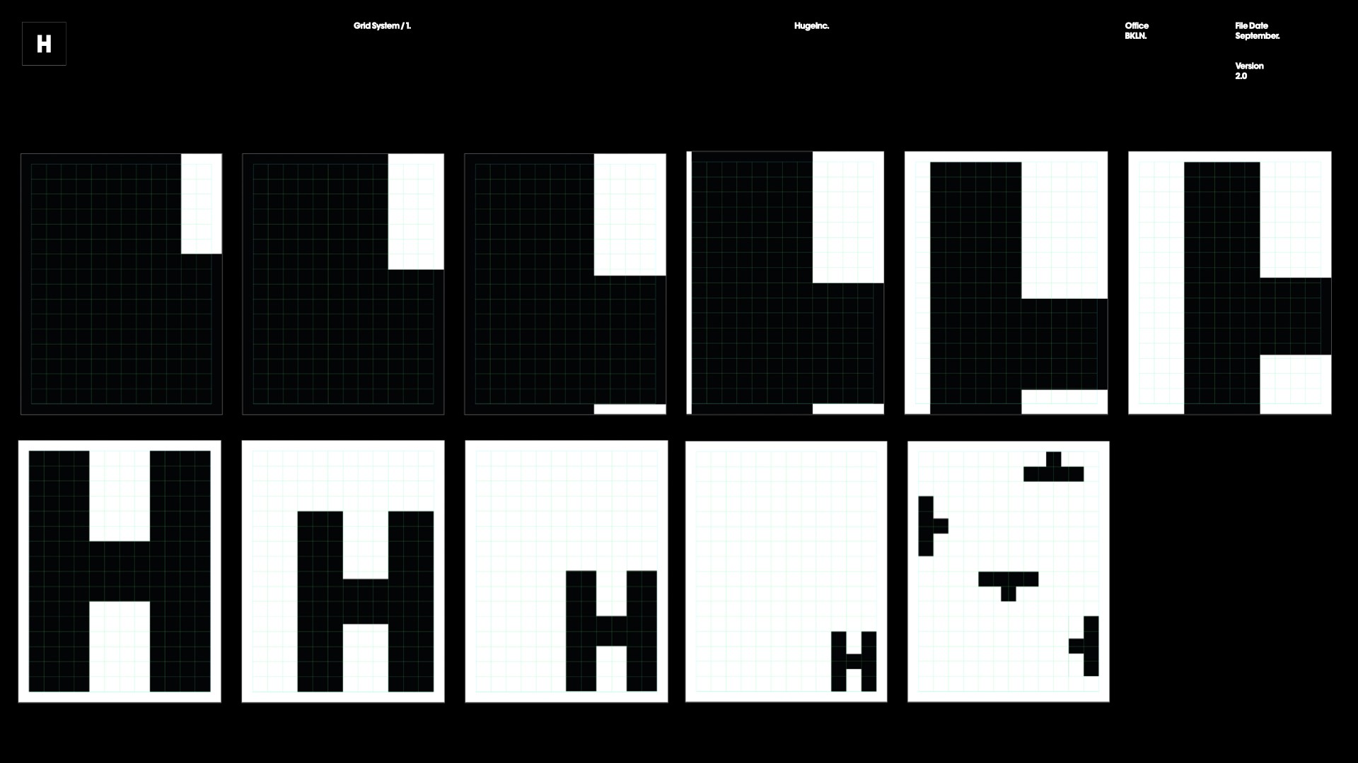
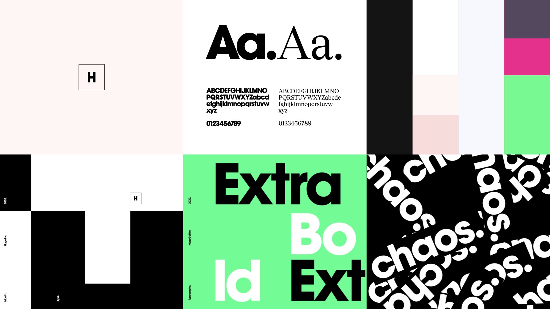
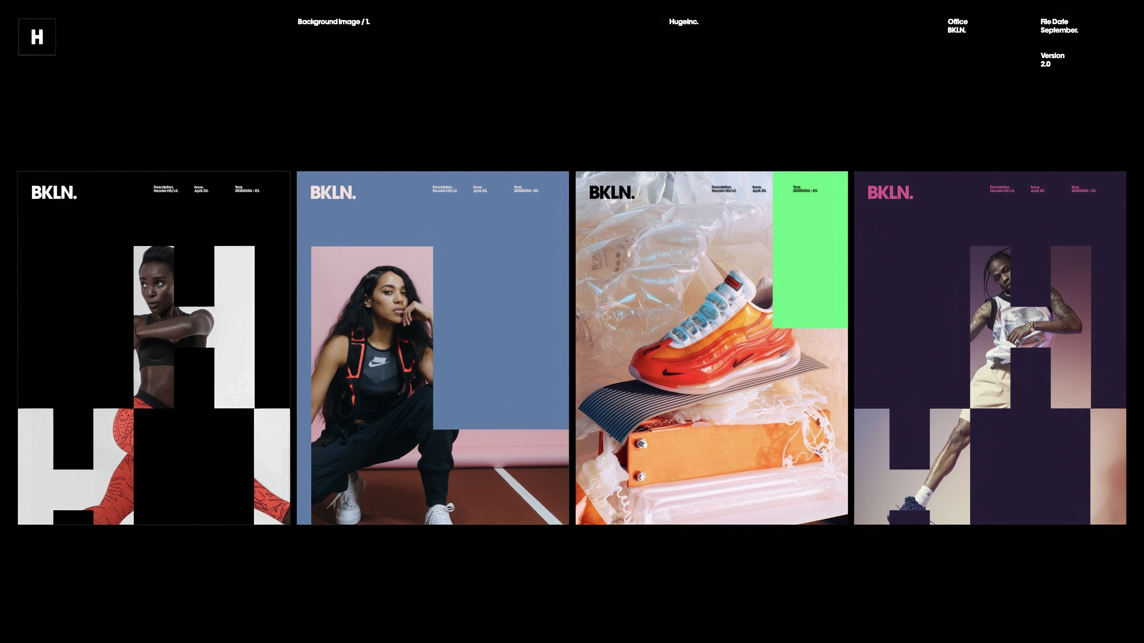
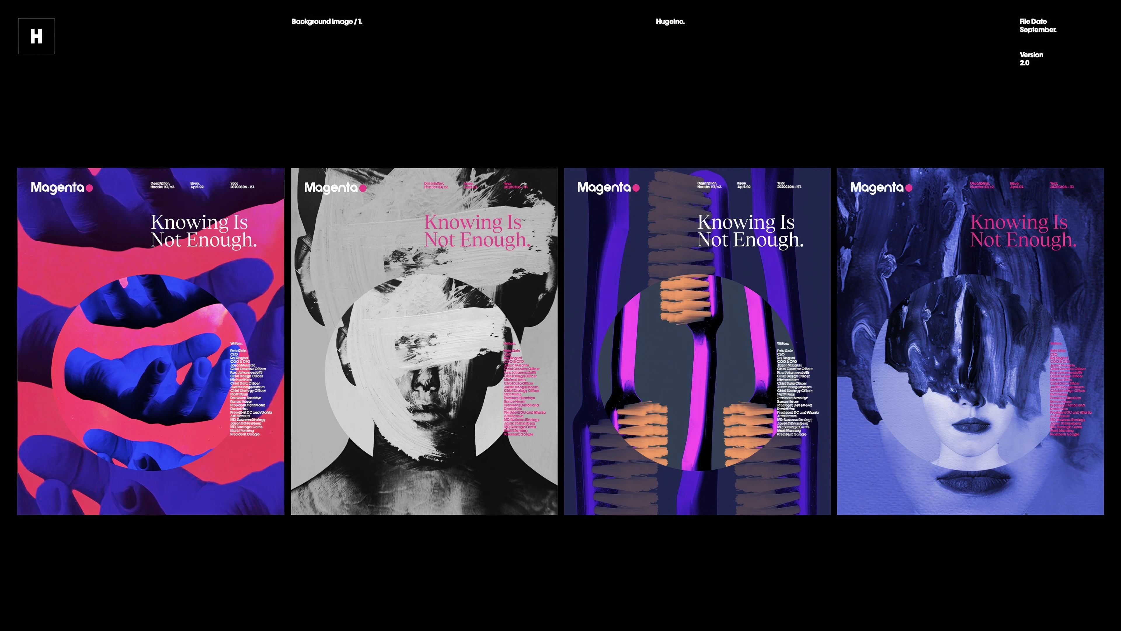
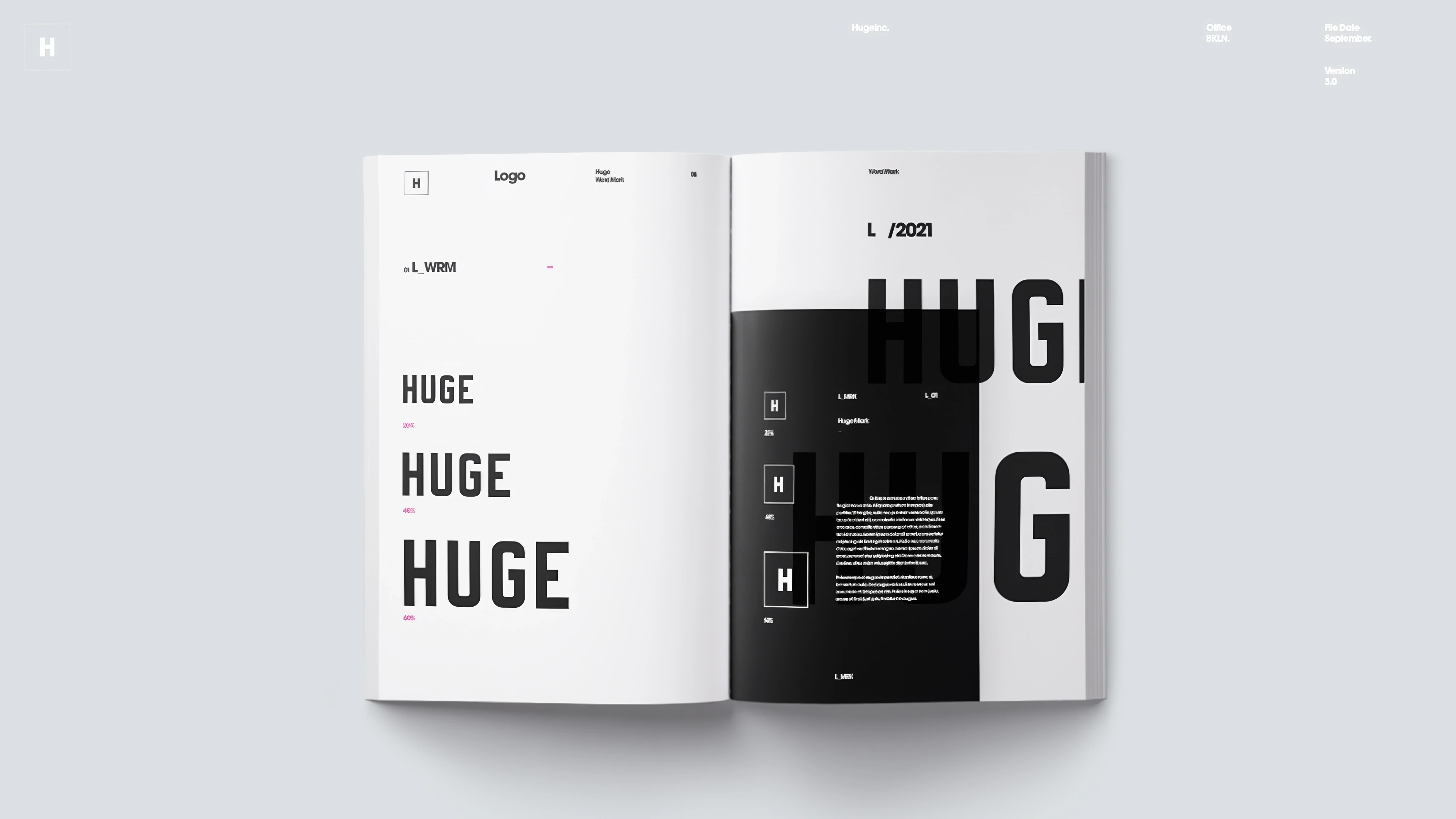
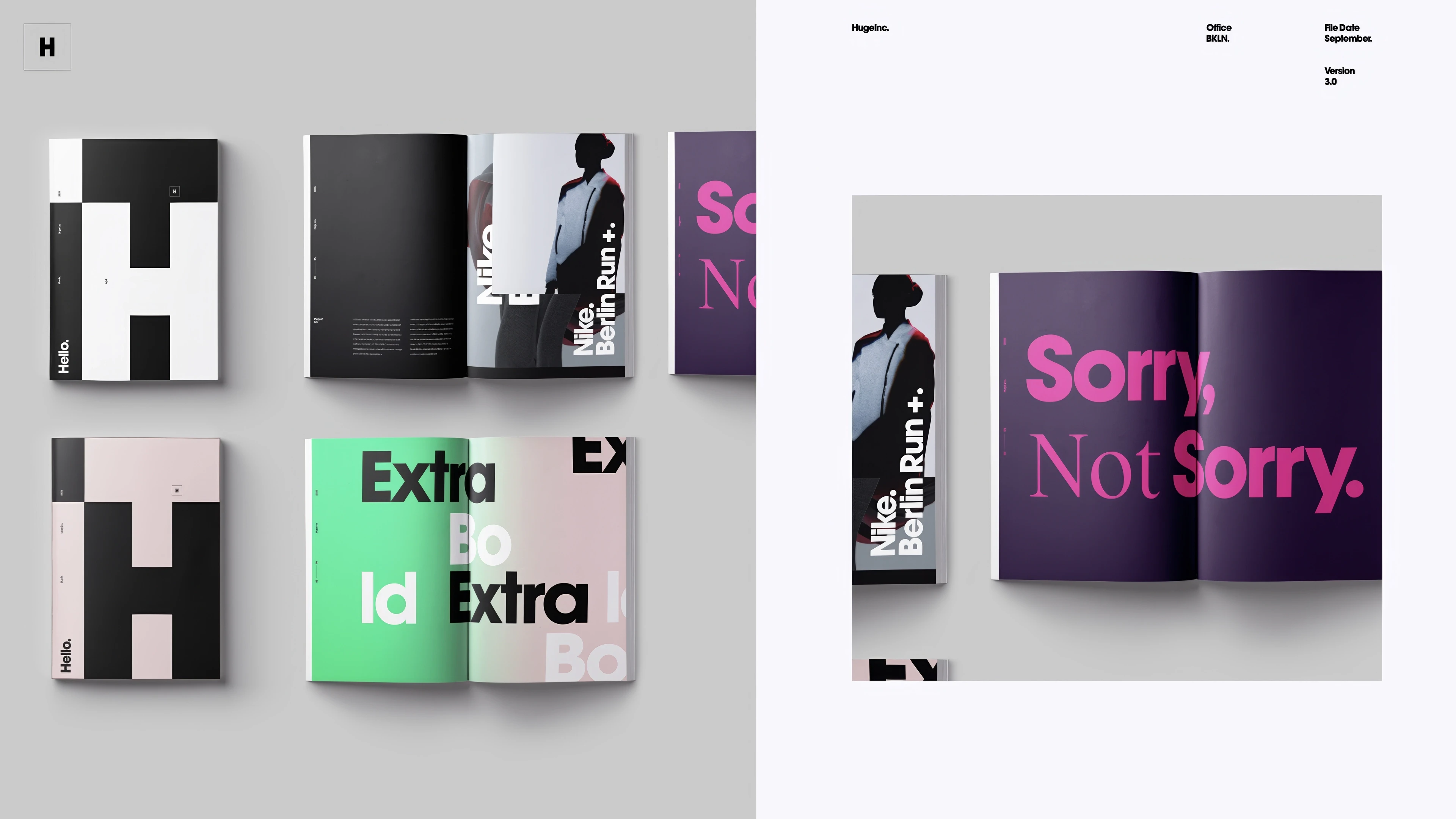
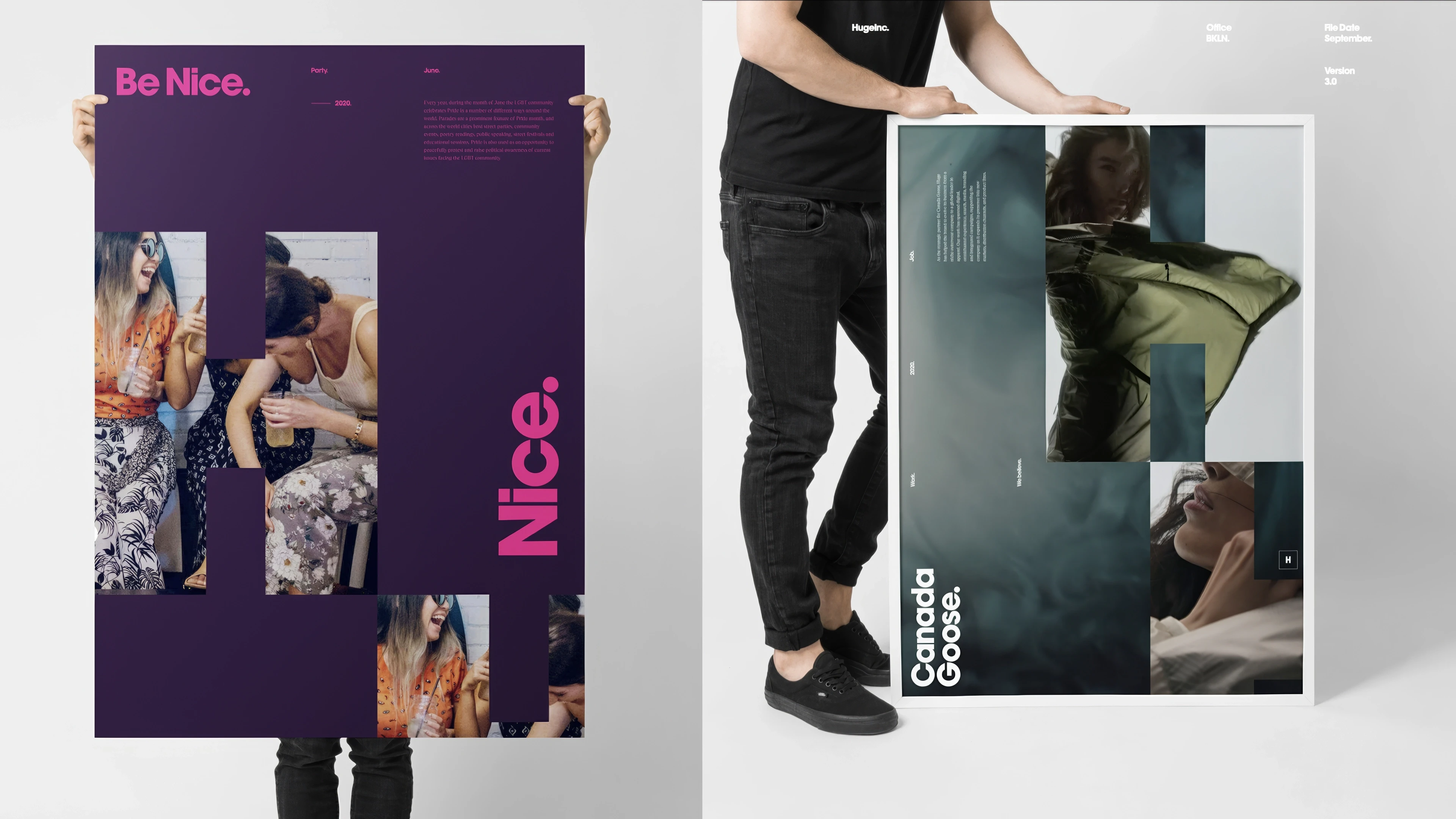
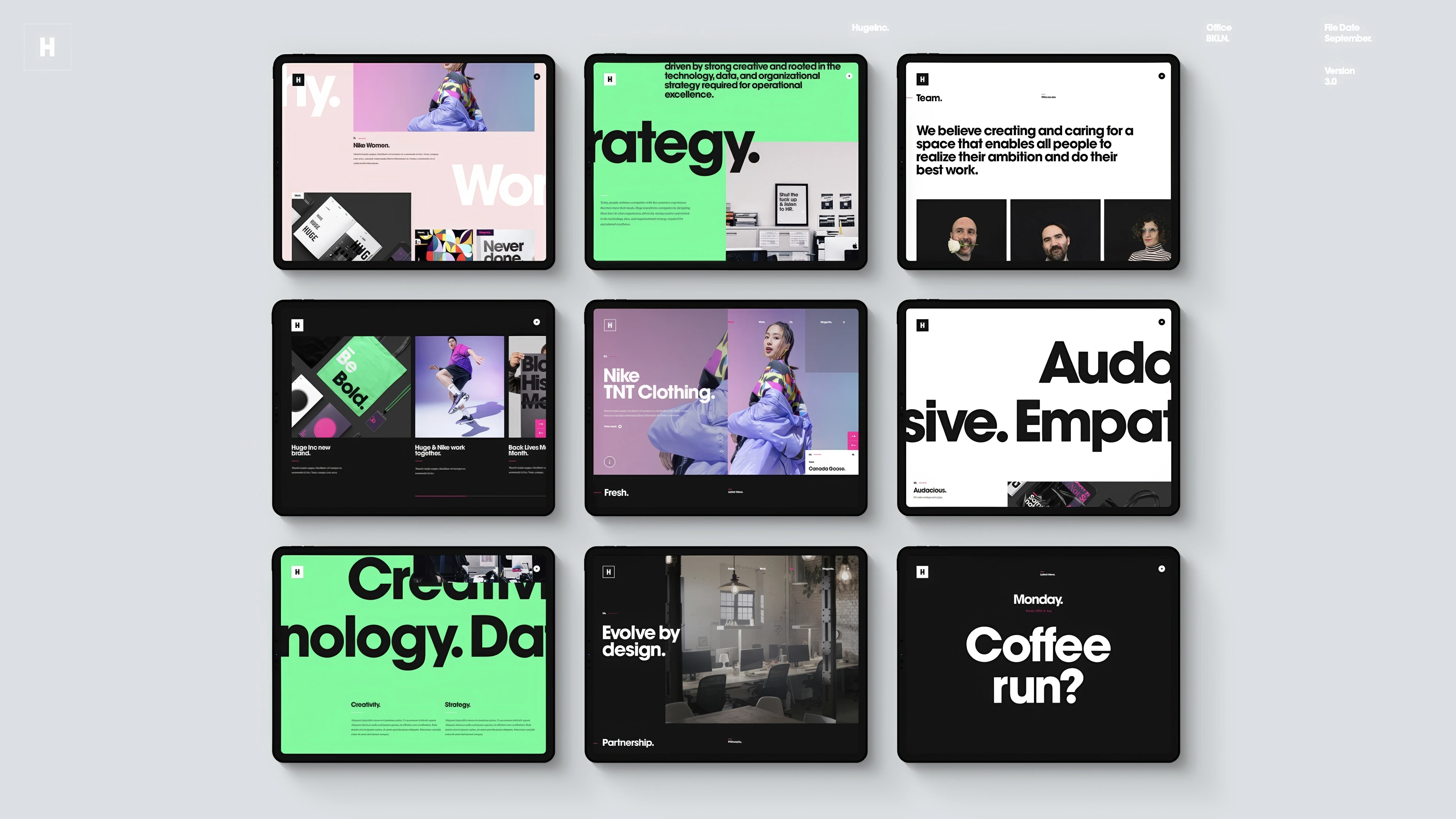
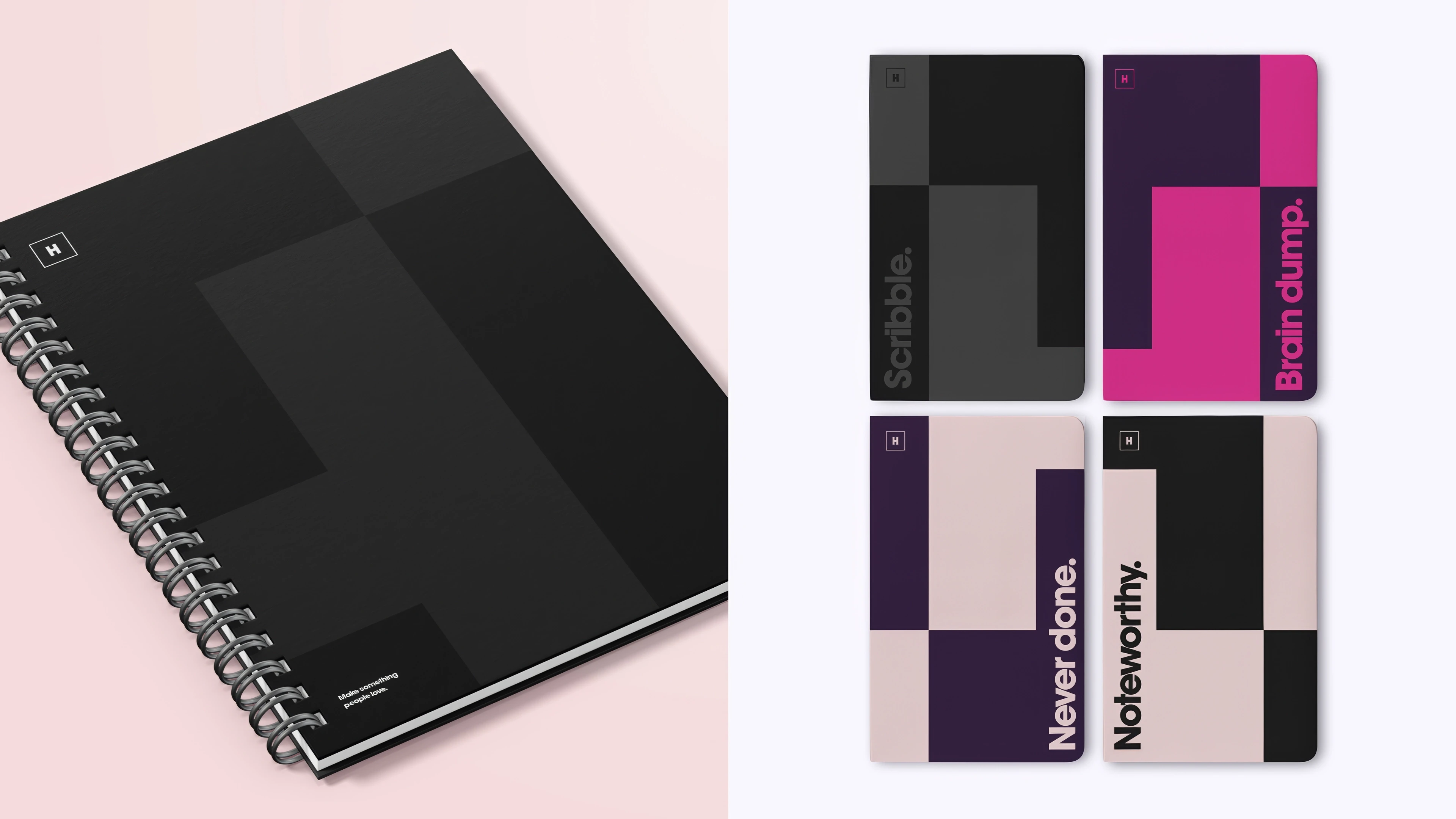
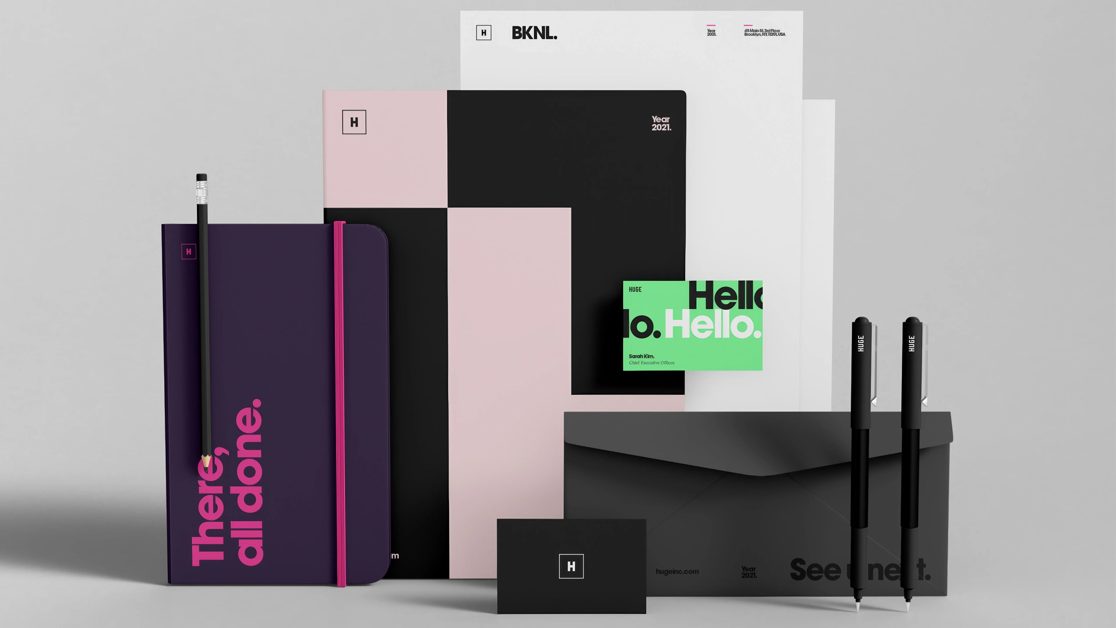
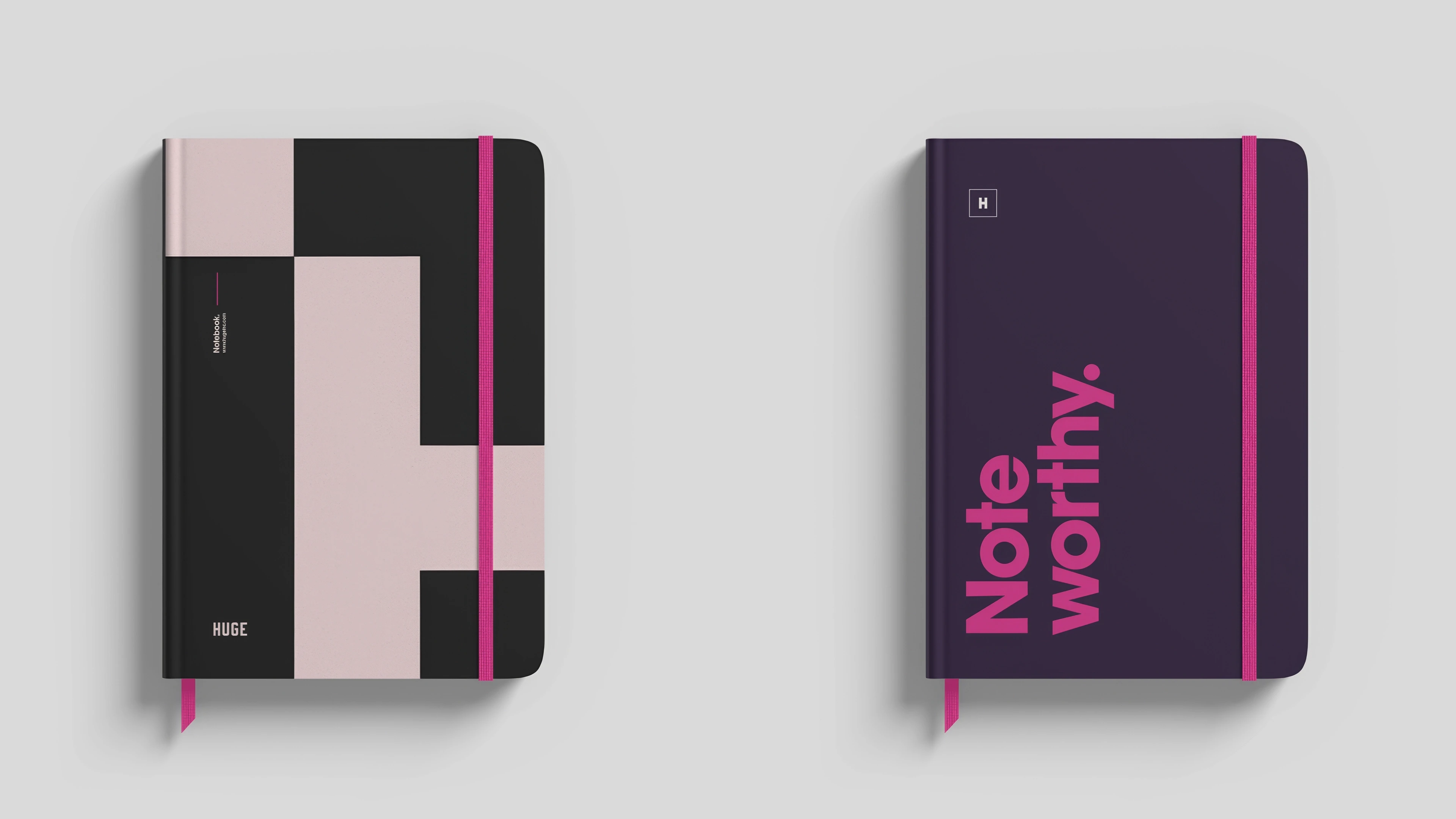
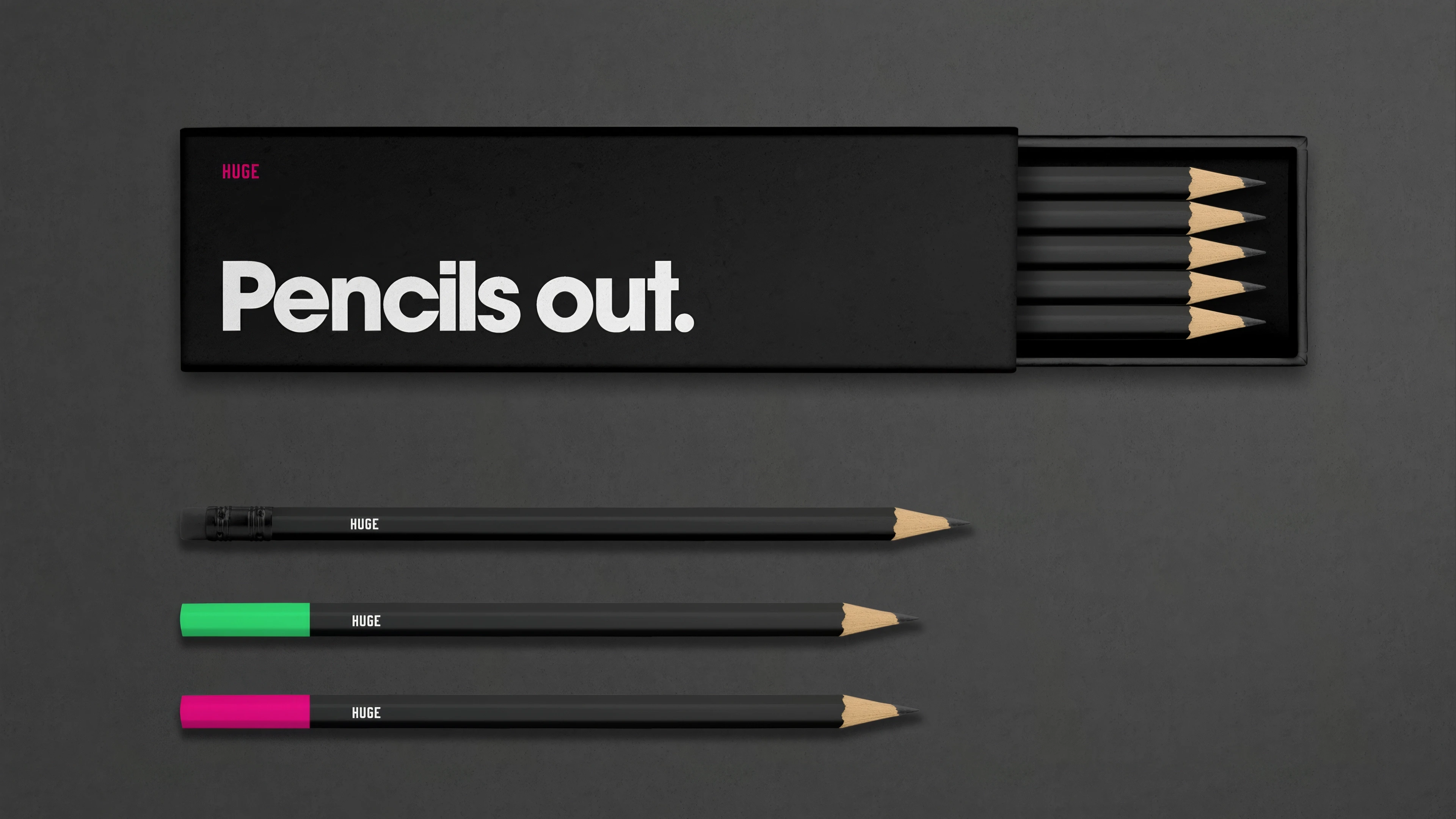
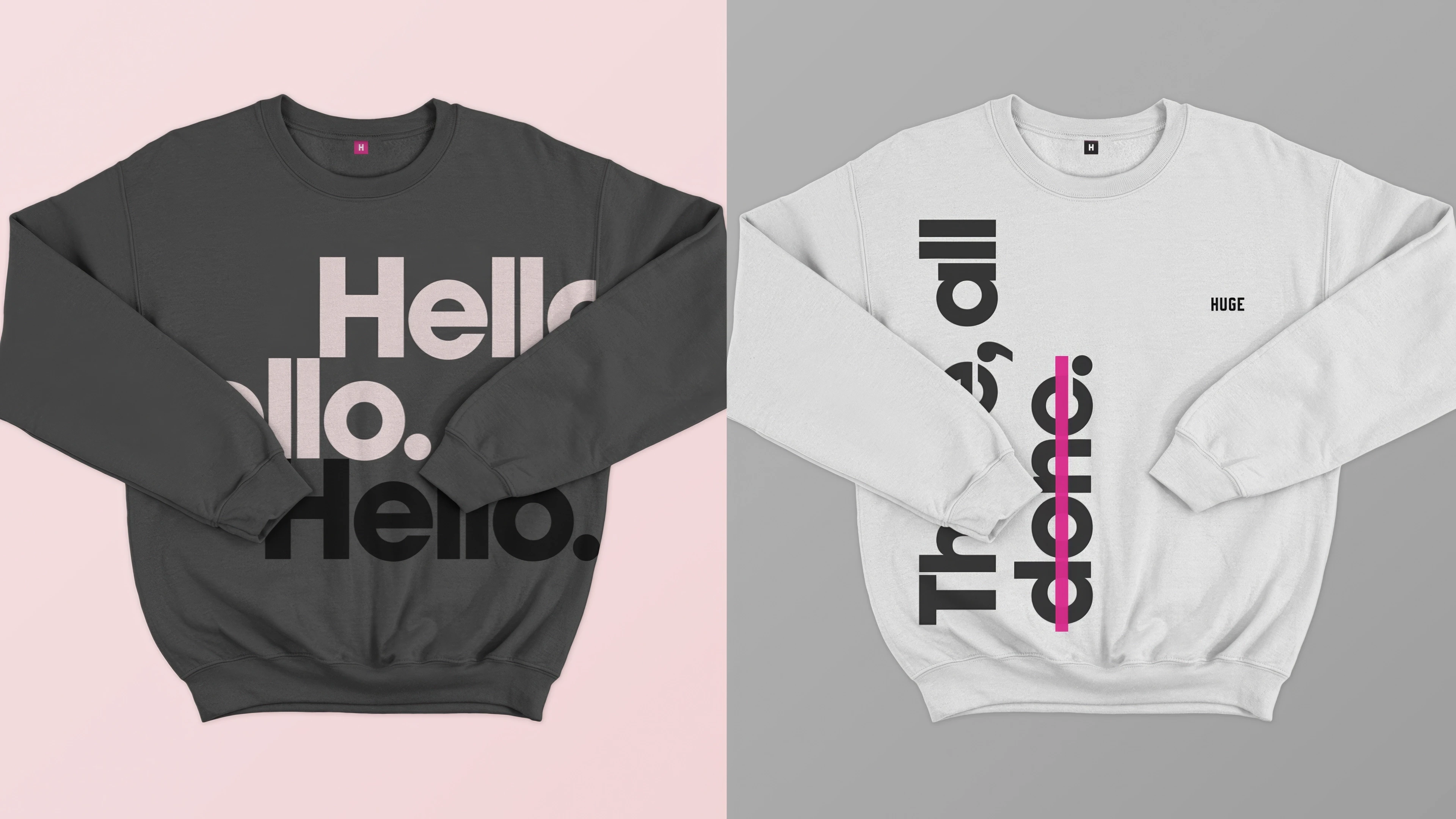
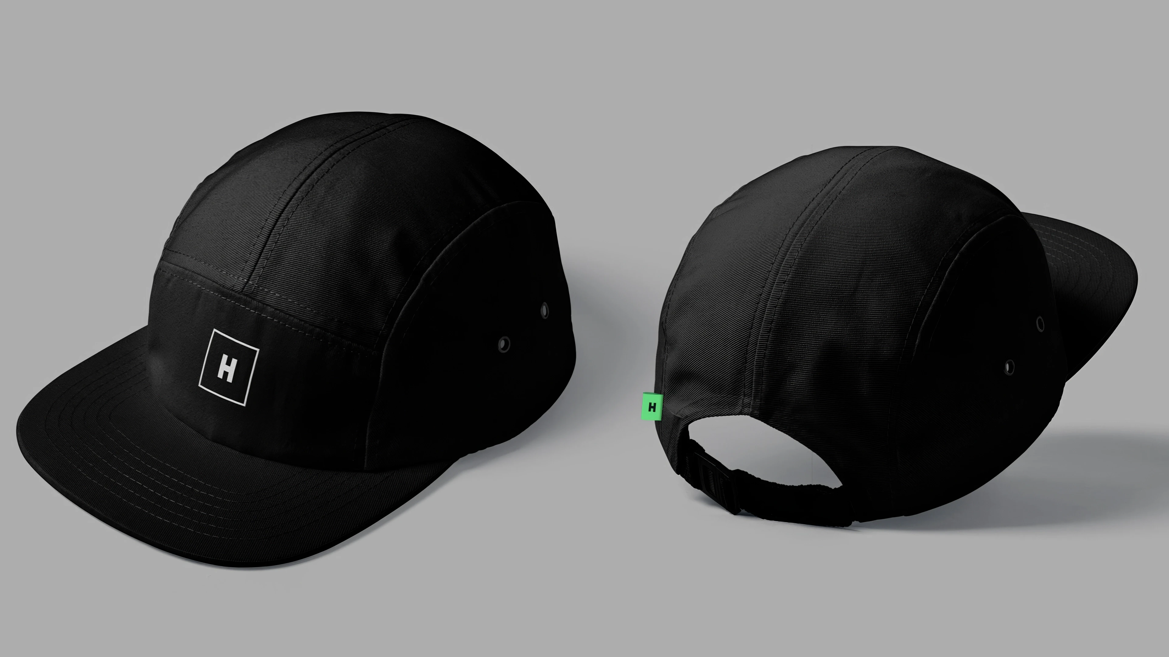
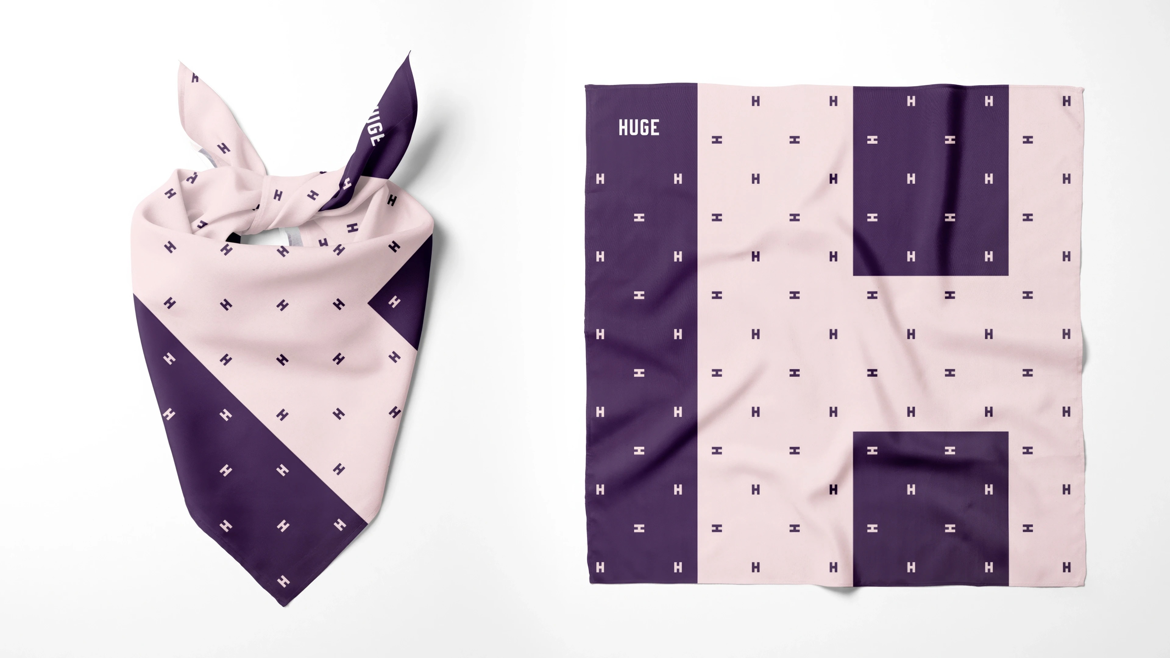
The updated brand expression centered on introducing a fresh and more vibrant color palette, revitalizing the typography with a new secondary typeface, and establishing a grid-based design language. This approach not only ensured a cohesive and consistent visual identity but also served as a catalyst for innovation and creativity.
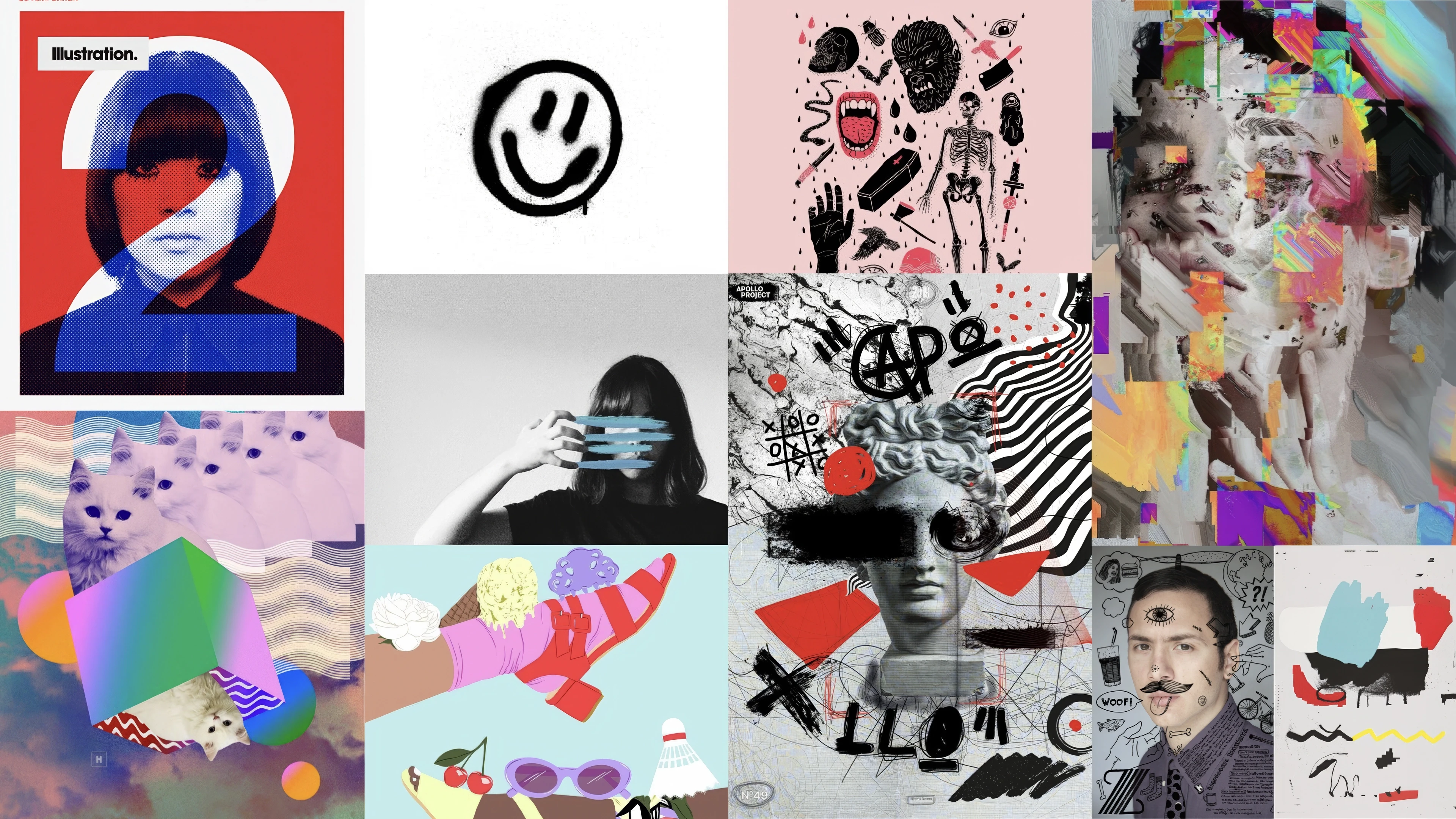
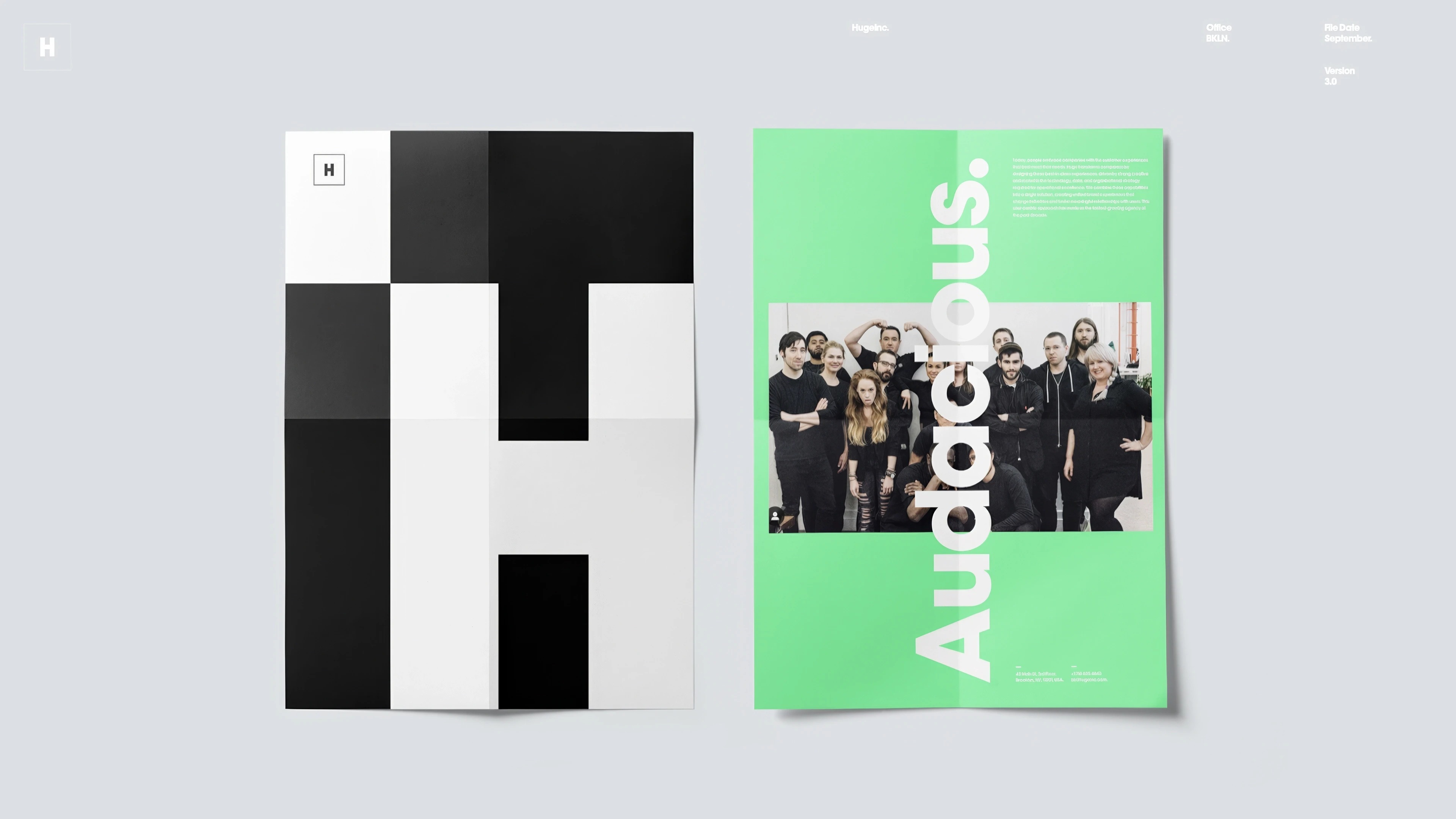
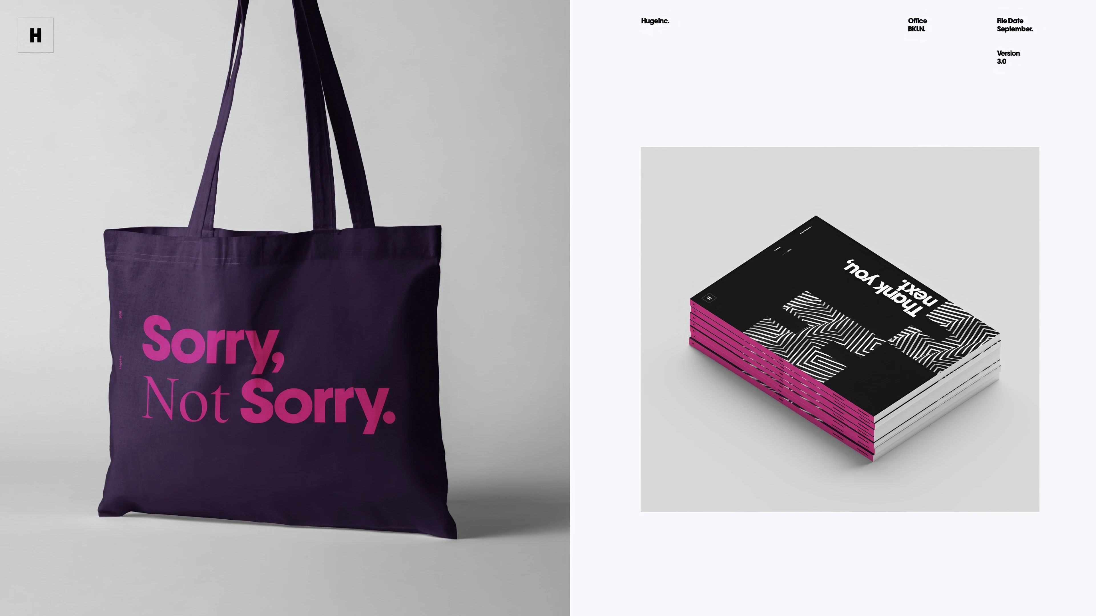
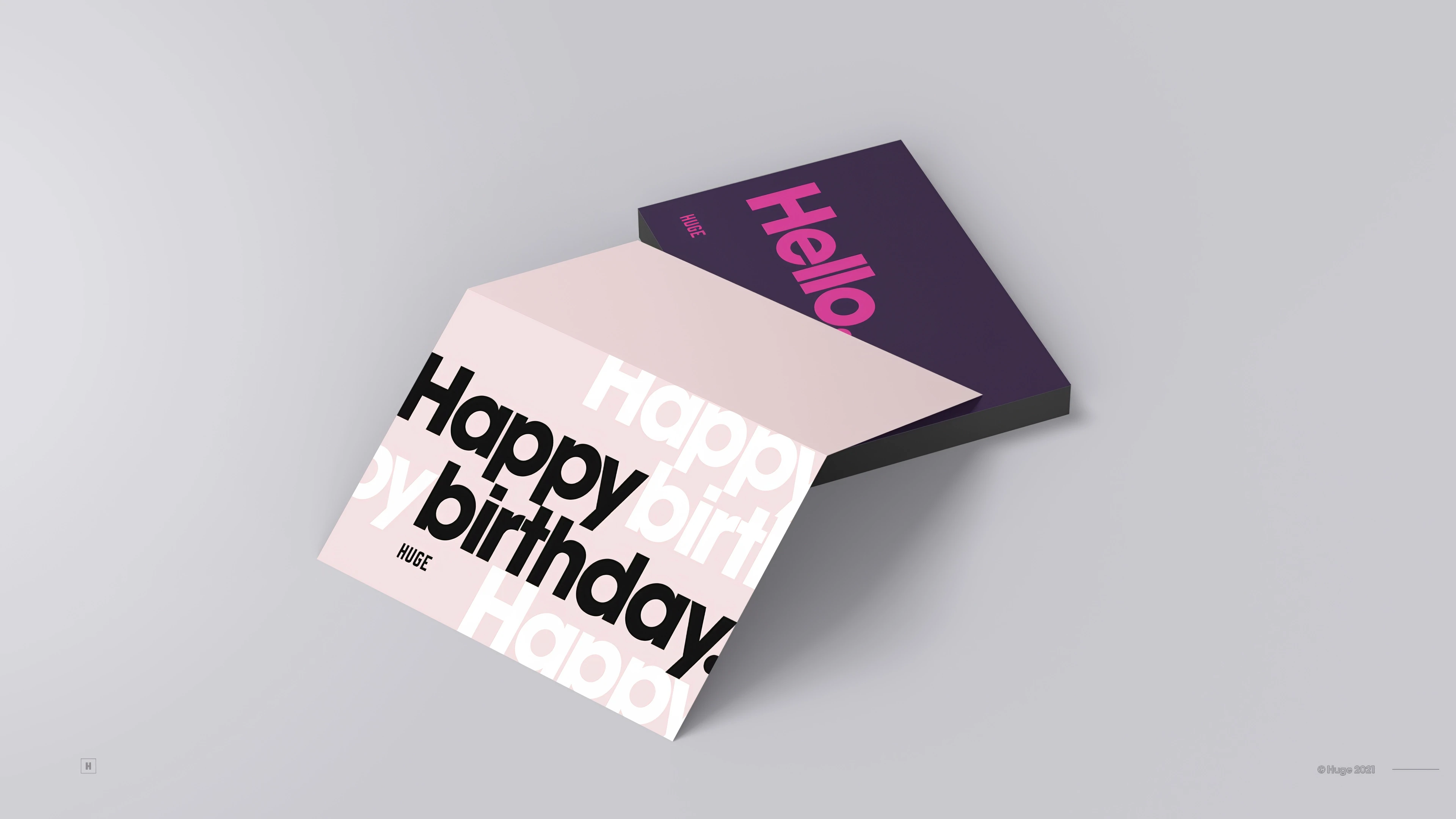
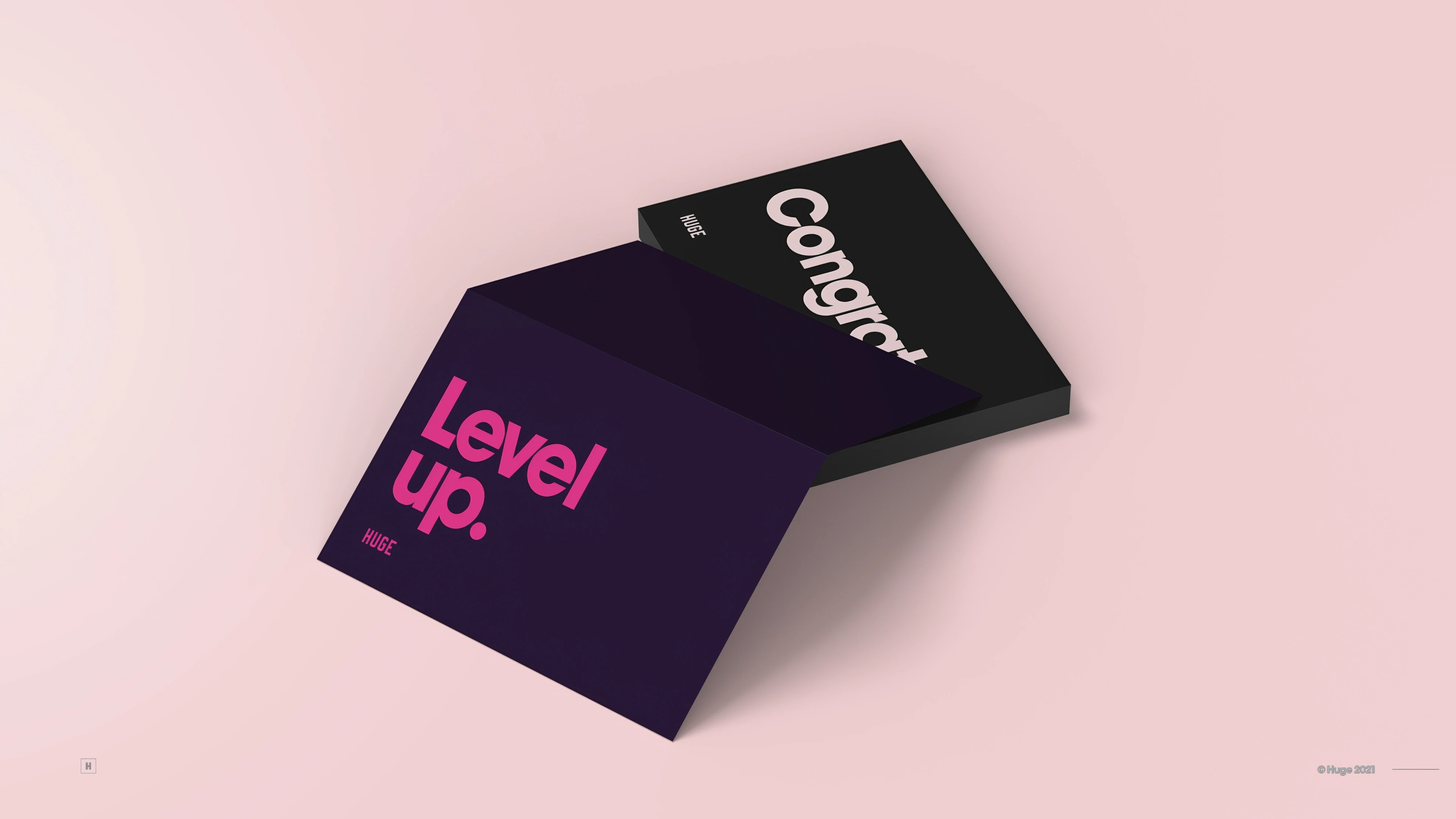
Our work extended to how the new brand could seamlessly integrate across various touchpoints, from digital platforms to physical collateral, ensuring a unified and impactful presence.
About two years later, the brand was refreshed once again, this time to a much more radical and, in my opinion, less distinct look.
Description
My Role:
Creative Direction
Design
Collaborators:
Elliot Wright
In 2020, the decision was made to undertake a significant update for the Huge agency brand. For a design agency, this can be one of the hardest things to do! With a longstanding focus on their brand identity, Huge has consistently positioned it as a way to stand out and a source of internal pride. Having been part of the company for nearly eight years, I had a unique understanding of its roots and heritage, making me a central figure in considering how to subtly modernize certain elements that were beginning to show signs of aging.
Collaborating closely with a small team, we embarked on shaping and refining the brand's evolution. Our objective was to build upon the foundation and rebellious appearance established by Huge in the past, preserving its iconic design and tonality while infusing it with a contemporary feel.
The updated brand expression centered on introducing a fresh and more vibrant color palette, revitalizing the typography with a new secondary typeface, and establishing a grid-based design language. This approach not only ensured a cohesive and consistent visual identity but also served as a catalyst for innovation and creativity.
Our work extended to how the new brand could seamlessly integrate across various touchpoints, from digital platforms to physical collateral, ensuring a unified and impactful presence.
About two years later, the brand was refreshed once again, this time to a much more radical and, in my opinion, less distinct look.
Description
My Role:
Creative Direction
Design
Collaborators:
Elliot Wright
In 2020, the decision was made to undertake a significant update for the Huge agency brand. For a design agency, this can be one of the hardest things to do! With a longstanding focus on their brand identity, Huge has consistently positioned it as a way to stand out and a source of internal pride. Having been part of the company for nearly eight years, I had a unique understanding of its roots and heritage, making me a central figure in considering how to subtly modernize certain elements that were beginning to show signs of aging.
Collaborating closely with a small team, we embarked on shaping and refining the brand's evolution. Our objective was to build upon the foundation and rebellious appearance established by Huge in the past, preserving its iconic design and tonality while infusing it with a contemporary feel.
The updated brand expression centered on introducing a fresh and more vibrant color palette, revitalizing the typography with a new secondary typeface, and establishing a grid-based design language. This approach not only ensured a cohesive and consistent visual identity but also served as a catalyst for innovation and creativity.
Our work extended to how the new brand could seamlessly integrate across various touchpoints, from digital platforms to physical collateral, ensuring a unified and impactful presence.
About two years later, the brand was refreshed once again, this time to a much more radical and, in my opinion, less distinct look.
Style Guide
Style Guide
Style Guide
Style Guide


Execution
Execution
Execution
Execution
Swag
Swag
Swag
Swag

Selected Work
Aliance Bernstein
American Airlines & Brittish Airway
SK-II & Procter & Gamble
SK-II
Universal Studios
Accenture
SK-II
SK-II
Pfizer
Huge
Selected Work
Aliance Bernstein
American Airlines & Brittish Airway
SK-II & Procter & Gamble
SK-II
Universal Studios
Accenture
SK-II
SK-II
Pfizer
Huge